Monday, April 30, 2012

a little bit of process


Hello! It's Krystal here. When Heather & I began planning kindred around a blue & white theme, I immediately began sketching out my ideas. I always seem to approach making in this way. First with pen & paper, then translating my line drawings into their clay forms. As the forms take shape, my thoughts shift  to pattern and surface design, figuring out how each pattern will correspond to the form. This is my favourite part of the design process. As most of my pottery is decorated with floral/plant based motifs, I couldn't help but think of the classic 'blue willow' china pattern each time I sketched a leaf or vine in blue. It's such a ubiquitous pattern. Yet adapting my vines & flowers to a blue and white colour scheme has been a refreshing change. I've been experimenting with more lines & geometric patterning as well (photos of those pieces to come!)


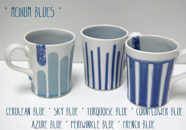
As Heather mentioned in her last post, choosing a favourite blue isn't necessarily as easy as you'd think. And once you have it, now try creating that perfect blue as a glaze. I've been searching for a variety of pleasing blues: teal, a juicy pure cobalt, a deep blue/black or blue/grey. In a glossy semi-transparent base glaze. One mixture I really love is a combination of cobalt & chrome. And another, a combo of cobalt carb & nickel made a speckled grey/blue with a tinge of green to it. The testing process has been exciting!

shades of blue


My favourite colour since as long as I can remember has been blue.  In grade school periwinkle blue stole my heart as the perfect blue, then it was Robin's Egg blue in High School, then a bright cobalt blue in the 90's.  It's hard to find a blue I don't like, but I've taken searching for the perfect blue quite seriously for the Kindred in Blue show.  The painter in me feels the need to pull out all the stops, so above you see my most thorough selection of blue stains currently in my studio.  Yeah, I have a bit of an obsession.
A little bit of clay geekery for you- the little bits of powder above are nearly all commercial stains- (mostly Mason Stains) used for ceramics to colour glazes, slips, and underglazes.  The cobalt you see up there is Cobalt Carbonate, which is the milder form of Cobalt oxide, which turns an incredibly deep blue when fired to high temperatures.  It may look rather mild- all pinky purple, but don't doubt for a minute that even a small smudge of this  stain on a pot will show up as blue. 
So what I've been doing is creating glazes either from just one of those stains, or a mixture of 2 of these with my 2 base glazes (one shiny and one semi-matt).  I've come up with some pretty shades of blue so far, but of course, there will be a few more that I'll reveal in my next glaze firing. 


Monday, April 23, 2012

Hello and welcome!

As this first blog post gets started we are pretty much 1 month away from the 'kindred' show at bookhou.  It is a show that has been just over a 1 year in the making, although the real work towards it, along with the actual pieces that will be exhibited are being made now.  This blog will be a place to document this process- the work leading up to the show, the inspiration behind the show, and some sneak peeks of the actual work that will be exhibited.

Krystal and I (Heather here) have both have had a really busy spring, but always in the back of our minds was our show and how we were going to link our work together in a cohesive way.  Both of us had been thinking about blue and white on our own, separately for a while, when it became a little more obvious that it could be a larger theme for our show.  An exhibit is often a good excuse to make new work, develop new ideas and processes along the way.  Some of the work we hope to exhibit will be similar to our usual work, others will be a departure from the usual.  We are almost ready to launch our promo and press for the show, which is really exciting.  Here is a glimpse of inspiration with some familiar work (my striped bottle vases) with some exciting new blue glazes on the way.